
It is hard to believe but The War at Victory 2012 has been over for almost a week. Actually, I am still in the recovery process, haha! The War this year was an obvious success because there were lives changed and challenged just like every other year. But from a design and media standpoint I want the War to succeed as well. There is a lot of work put in and I want the event to look good. There was so much that went on I wanted to share, that I decided to break it up into 2 blog posts. In the first I will talk about the website, and then the video in the second. If you are unfamiliar with The War at Victory, my last blog HERE will fill you in, or visit the site HERE.

The plan for the website used for the war is very simple. We get tons of video and pics during the event, and we want to make as much as we can available online as soon as possible. It also serves as a great reference point for the teams scores, information, and special online challenges. Last year, I built a basic setup for the event with a gallery for pics and vids and a homepage which showed the score. This year I wanted to really incorporate the “Scoreboard” and make it look real. Considering I am a web design Novice! Let me put it simply, the 2012 War at Victory website is probably one of the coolest thing that I have ever been able to design!
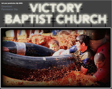
After watching SportsCenter and Google searching baseball stadiums I decided to try and create the look of a digital scoreboard. Unfortunately, I couldn’t really find what I was looking for so I tried sketching out some ideas. I put together a regular rectangular display frame with images inside. Then I incorporated a bunch of dots to overlay the images and give sort of a LED display feel to the viewer. Once I built and previewed a slideshow to be used on the website homepage, I knew I was headed in the right direction.
I continued to play around with the LED look and used the same effect to add a large Victory Baptist Church sign hovering over the scoreboard display. Now, the scoreboard really looked like something you would see in a stadium.

Eventually I decided to try to incorporate the lights effect on the website menu as well. I was really happy the way it all turned out.
That being said, a website that no one visits is worthless no matter how cool it looks. This year I was able to keep track of some traffic statistics for the site and the numbers were very encouraging. We averaged a little over 100 teenagers at the event each night. Over the course of the 3 Day event the website saw about 400 visits, with around 1000 page views! Considering the updated content was only on 2 pages, the Home page and Gallery page, I think those numbers were very good. Not only did we get visitors to browse, but we got them to come back again and again
The numbers on the War videos that we did were even more staggering. I will talk more about these in my next post, but here are the numbers as of today. You can check them out on the site HERE.
The War at Victory 2012 Promotional Commercials (4 of them): 1,001 views
12 Event Videos: 1,084 views
3 Highlight Videos: 468 views
Total 2012 War Video views so far: 2,553
Amazing!


No comments:
Post a Comment