Thursday, May 24, 2012

The War at Victory 2012 Review - Part 2 - The Videos

ScreenShot2012-05-24at5.15.29PM-2012-05-24-17-29.png

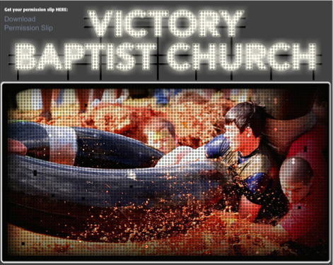
The War is one of our biggest events at Victory Baptist Church, so we always try to bring our A-Game. Earlier in the year when we were planning out the event, we wanted to do some creative promo videos again this year. This was the final straw In my decision to upgrade some equipment. My current setup for video was severely lacking, especially when it came to High Definition. After much debate I took the plunge on Final Cut Pro X, which deserves a whole blog article in its own right. I also upgraded my Canon DSLR to a T2i so I could get some HD video. And so the War at Victory 2012 Commercials began.


We released the first Commercial, “Gone Fishin”, two weeks before the event started on May 10th, as well as a movie trailer with a few clips from last year. A week later Commercial 2 , “The Basement”, followed and finally Commercial 3, “It’s Here”, on the morning of the event. As I mentioned in the Part 1 blog they were a success, they have been viewed over 1,000 times. Surprisingly, the Gone Fishin ad seemed to get the most response from people. It was funny because I really struggled a lot with that one. It all made sense when I was sketching out a script and shooting the video. But when I started editing it, it didn’t seem to make sense anymore. A guy goes fishing and some stranger pops out of the water, now what does that have to do with the War? After a lot of time and Mountain Dew it all seemed to work out. These seem to be the solution for many a creative problem, hahah!


ScreenShot2012-05-24at6.07.00PM-2012-05-24-17-29.pngScreenShot2012-05-24at5.42.52PM-2012-05-24-17-29.png

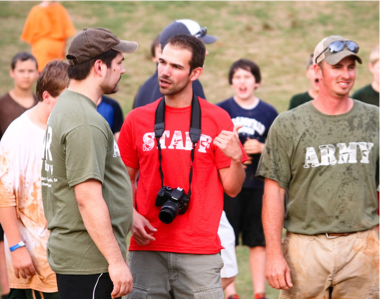
A ton of thanks goes out to folks who helped out with the commercials, especially Dallas Brown and John Higgins. They did a great job and I am sure that their acting careers will continue to blossom.


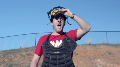
Next, was the event videos themselves. This is my number one job during the War. I’ve got to get as many good video clips on the website as quick as possible. The goal is to have these video clips up for the kids to view as soon as each night finishes up. Then by the next morning, I try to have an edited highlight video finished. This is not an easy task, and fortunately I was able to get one of my best pals to help me this year. A huge thanks to Chris Waye. He got tons of great video, mastered the Youtube upload, and put up with me yelling at him every night. His assistance allowed me to concentrate on the slideshows and website updates, and it wouldn’t have been possible without him. Chris, since I can’t pay you, here is a shameless plug - Go to this website for the Waye Family - Missionaries to the British Isles - and assist them financially or prayerfully.

ScreenShot2012-05-24at5.11.55PM-2012-05-24-17-29.png

I also want to thank Tyler Payne for being my go to GoPro guy. I was able to get my hands on the new Hero2 from GoPro and got some awesome action shots. Adding the GoPro camera to the mix made the highlight videos a lot more entertaining. With all of the media that we got, it was difficult to choose which shots and clips to use. Really, that’s not a bad problem to have.

IMG_7901-2012-05-24-17-29.jpg

Finally, I wanted to give a shoutout to my uncle, J Hardee of Hardee Imaginations Photography. He and his photo assistants are also running around like crazy during the event, trying to get that perfect picture. I didn’t think he could outdo the pictures from the War event from last year, but he just might have done it! He took a ton of pics and you can see them on his website Here.


The War at Victory is really a giant undertaking. There are long hours spent in preparation, presentation, and post War cleanup. It took me over a week to recover. Wow! I can’t wait til next year!


Stay up to date with The War at Victory or check out the 2012 highlights at our site www.thewaratvictory.com

Friday, May 18, 2012

The War at Victory 2012 Review - Part 1

TheWaratVictory-2012-05-18-15-53.jpg

It is hard to believe but The War at Victory 2012 has been over for almost a week. Actually, I am still in the recovery process, haha! The War this year was an obvious success because there were lives changed and challenged just like every other year. But from a design and media standpoint I want the War to succeed as well. There is a lot of work put in and I want the event to look good. There was so much that went on I wanted to share, that I decided to break it up into 2 blog posts. In the first I will talk about the website, and then the video in the second. If you are unfamiliar with The War at Victory, my last blog HERE will fill you in, or visit the site HERE.

TheWarWebsite2011-2012-05-18-15-53.png

The plan for the website used for the war is very simple. We get tons of video and pics during the event, and we want to make as much as we can available online as soon as possible. It also serves as a great reference point for the teams scores, information, and special online challenges. Last year, I built a basic setup for the event with a gallery for pics and vids and a homepage which showed the score. This year I wanted to really incorporate the “Scoreboard” and make it look real. Considering I am a web design Novice! Let me put it simply, the 2012 War at Victory website is probably one of the coolest thing that I have ever been able to design!

Scoreboard%252526Sign-2012-05-18-15-53.png

After watching SportsCenter and Google searching baseball stadiums I decided to try and create the look of a digital scoreboard. Unfortunately, I couldn’t really find what I was looking for so I tried sketching out some ideas. I put together a regular rectangular display frame with images inside. Then I incorporated a bunch of dots to overlay the images and give sort of a LED display feel to the viewer. Once I built and previewed a slideshow to be used on the website homepage, I knew I was headed in the right direction.


I continued to play around with the LED look and used the same effect to add a large Victory Baptist Church sign hovering over the scoreboard display. Now, the scoreboard really looked like something you would see in a stadium.


WebMenu-2012-05-18-15-53.png

Eventually I decided to try to incorporate the lights effect on the website menu as well. I was really happy the way it all turned out.


That being said, a website that no one visits is worthless no matter how cool it looks. This year I was able to keep track of some traffic statistics for the site and the numbers were very encouraging. We averaged a little over 100 teenagers at the event each night. Over the course of the 3 Day event the website saw about 400 visits, with around 1000 page views! Considering the updated content was only on 2 pages, the Home page and Gallery page, I think those numbers were very good. Not only did we get visitors to browse, but we got them to come back again and again

The numbers on the War videos that we did were even more staggering. I will talk more about these in my next post, but here are the numbers as of today. You can check them out on the site HERE.


The War at Victory 2012 Promotional Commercials (4 of them): 1,001 views


12 Event Videos: 1,084 views


3 Highlight Videos: 468 views


Total 2012 War Video views so far: 2,553


Amazing!

Friday, May 11, 2012

The War at Victory 2012 has begun


The War at Victory is officially here. Check out the website and some of the sights and sounds we have seen so far on the Gallery page. This website homepage is probably the single most awesome graphic design I have ever worked on. I hope the kids like it. I will post an update at the end to share how everything went. As you can tell by the preview video here and those on the website, I have recently become addicted to time lapses. I will probably share more in the future on that as well. It’s so easy to do with spectacular results. I'm learning something new every time I do one.  You can make anything look interesting.  Who would have guessed that Loganville could be a photography hot spot. haha!


www.thewaratvictory.com
Victor Design Blog

Random thoughts on Advertising and Design.

Vic's Posts

Followers

HomeRO1
AboutRO1
PortRO1
ContactRO1
BlogRO1